2024
Fubon Insurance App
Elevating the insurance management experience for policyholders with seamless ease and precision.

Overview

Fubon Life Insurance launched the mobile app decades ago. However,  it received a low app rating due to poor navigation, outdated design, and system performance. To enhance user engagement and satisfaction, we revamped the information architecture, user flows, and interface.
MY ROLE
Senior UI Designer
MY SKILLS
Competitive Analysis, Ideation, UI Design, Prototype, Design system
TEAM
Alan Yang, Katherine Chen, Amy Lin, Joanna Kim, Ann Wang, Michelle Wong
DURATION
6 months (2024.4-2024.9)
Challenges
  • Fubon’s internal digital development is lagging behind, without integration of relevant digital services.
  • Users struggled to search and access the details of their insurance policies.
  • Users faced difficulties tracking the progress of insurance claims.
Project Goals
  • Provide useful information to help users tackle tasks online by themselves.
  • Provide users with timely and up-to-date information.
  • Help policyholders manage their insurance efficiently.
Facilitate consensus through stakeholder interviews
We conducted stakeholder interviews with 5 stakeholders from 6 departments to understand cross-department expectations and constraints. Furthermore, due to the uneven level of digital development within Fubon company, these interviews helped align departmental consensus and support the subsequent design process.
Stakeholder interviews
Use FigJam to summarize
Clarify policyholders' goals and the current state of the app to build a strong interactive relationship
We listed all the insurance services provided in the app and analyzed them by using a user journey map, simplifying them into three main service categories:  Awareness / Product inquiries, Basic tasks, and Advanced transactions.
Journey map
Brainstorm different solutions based on the prioritization of user needs and business goals
To discover design solutions aligning with both user research findings and business goals, We generated several potential solutions initially and narrowed our focus to two ideas, as they aligned more closely with our design goals.

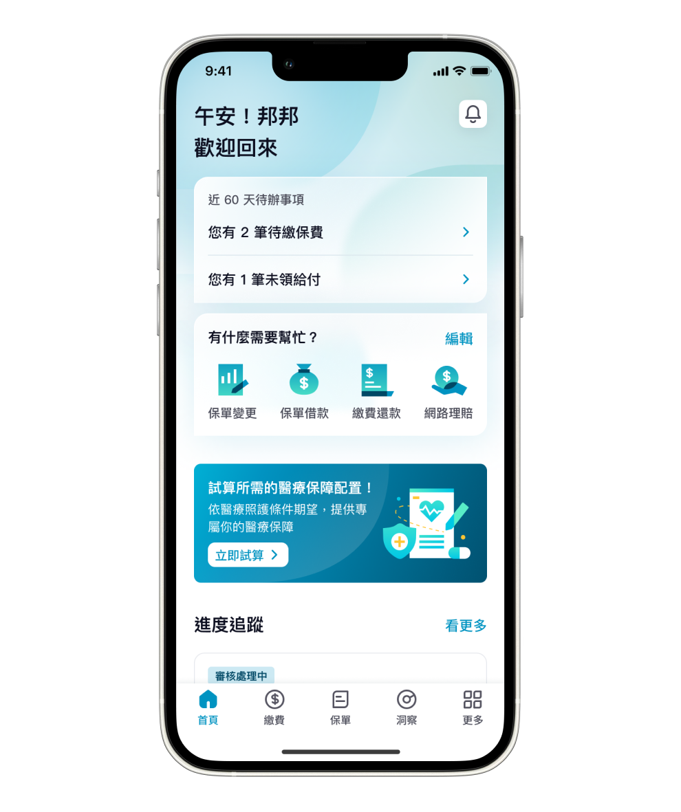
I collaborated with a UX designer to discuss direction A, focusing on the information architecture, layout, and interaction experience. We explored multiple versions during the discussions, and in the end, our client chose direction A as the final version.

Goal-oriented

From the big picture to the details, collecting fragmented information, refining the key information that policyholders care about to quickly grasp the overall picture.

Made simple and accessible

Arrange information from simple to complex according to its level of understandability, allowing policyholders to use it intuitively, and explore more details through guidance
Collect feedbacks from actual users
We conducted 10 usability testing sessions. I used Figma to create a prototype for interviewees to interact with. Based on user feedback, we found that many users had a low frequency of using insurance-related services and were unfamiliar with some of the functions. As a result, our goal was to improve user navigation to simplify basic tasks and policy management.

In response, I iterated the design by:
  • Reorganized the homepage information layout to enhance functionality and ease of use.
  • Enhanced the visual of function entry and improve the readability of information.
The Interviewee prioritized insurance services
Taking notes on FigJam

Design Highlights

We prioritized the content that matters most to policyholders, redesigned the information architecture, simplified the online application process, and highlighted key information with visual elements. This enhanced the information's accessibility and created more opportunities for interaction with policyholders.

01

Extract key personal information on the homepage

Use a dashboard to present an insurance overview, allowing policyholders to quickly grasp their insurance status and identify coverage gaps. Additionally, the homepage shows personalized information, such as payment and payout details, as well as any ongoing changes or claims progress.

02

Present insurance services with thematic categories to improve search efficiency

Provide a "Service" section that emphasizes communication and reinforces the impression of Fubon’s comprehensive services. At the same time, arrange the features in order from high to low frequency, making it easier for users to find what they need.

03

Offer an overview of insurance coverage for both individuals and families

Allow policyholders to clearly identify each policy in the list, effectively assisting them in managing or querying their policies in real time. Additionally, with the tab, users can quickly focus on the policy they wish to query in the case of having multiple policies.

What did I learn?

  • The client had no prior experience working with external design teams. Establishing a foundation of trust and an effective communication model significantly facilitated a smoother design process moving forward.
  • When entering unfamiliar domains, it’s essential to quickly acquire domain knowledge—such as regulations or technical constraints, ensuring the product is well-grounded and practical.